“We spent thousands on ads, but people just kept scrolling past.” That was Marcus, founder of a boutique fitness studio in Singapore, frustrated after launching a new campaign. He hired a social media agency, yet his offers barely registered. After a redesign that restructured text hierarchy, visual emphasis, and storytelling flow, interest and engagement shot up—people finally understood what mattered first.
What changed? His design didn’t just look good—it communicated clearly and guided the eye through a story. That’s the power of thoughtful text hierarchy combined with intentional visual elements.
In today’s crowded digital landscape, strong content alone isn’t enough. Your audience decides in milliseconds where to look first and what to absorb next. Getting this wrong means your message gets lost; getting it right means your story lands—and your business wins. There’s actually psychological logic behind this.
It’s a way of grouping items in such a way that they appear as if they’re “above,” “below,” or “at the same level.”
Creating something beautiful isn’t the only goal of design. It’s about making something useful. Putting something together that the user can easily consume and understand. Hierarchy plays a huge role in that. Hierarchy, from the Greek word hierarchy or ‘rule of the high priest’, is an arrangement of items or elements in which the items are represented as “above,” “below,” or “on the same level.”
This concept is applied in design by arranging or presenting elements in a way that implies importance. Design elements convey a sense of importance visually by using colors, contrasts, textures, shapes, positions, orientations, and sizes.
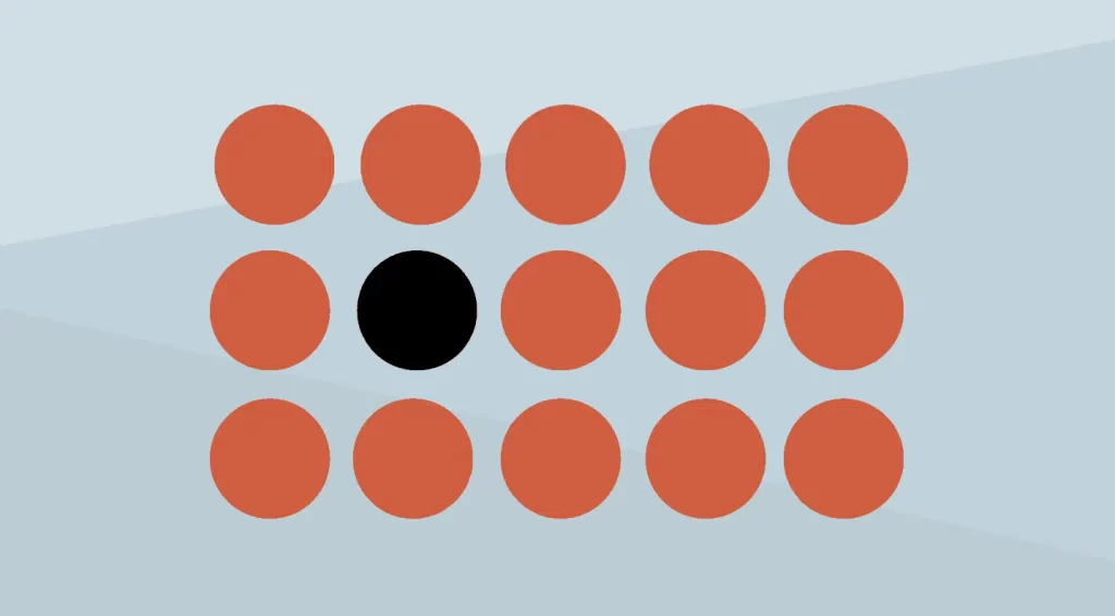
A few examples will help you better understand. Here are 15 perfect, red circles. The image draws your attention more to the group of circles than to one particular circle.

Here’s where we add some color. When you see the group of circles, you immediately notice the black circle in the middle left. That was done on purpose. Black makes your mind detect the difference.
Hierarchy: Why Is It Important?
A designer’s tool belt includes many tools, but hierarchy is one of the most important. Hierarchy helps differentiate and prioritize visual elements and content, so the human mind knows what is more important and what should be consumed first.
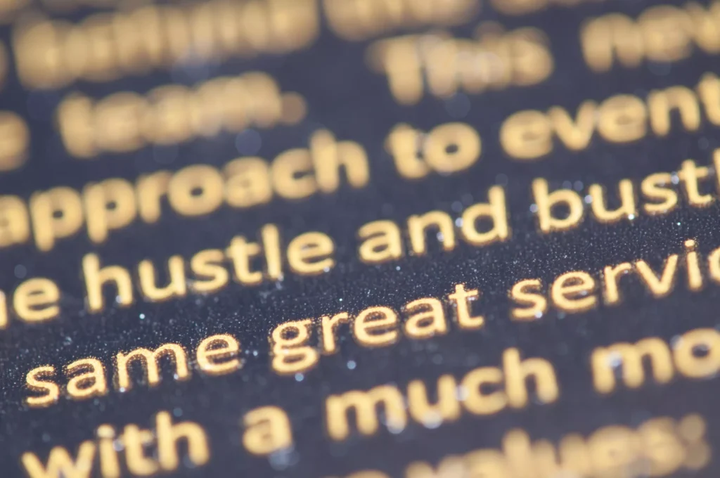
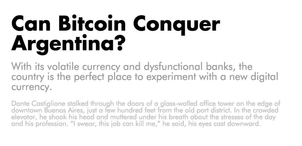
Design is not just about red circles, as the examples above illustrate. Let’s take a look at an excerpt from the New York Times:
It’s a great piece of content. This is fantastic, in fact. However, something is missing. The article is difficult to read. Aside from the content itself, there is nothing separating the title from the body.
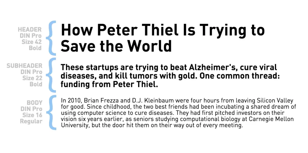
Let’s do some magic now.
That’s it! We simplified the excerpt by using font size and color. The reader will be able to focus on your story when you incorporate visual hierarchy into it. A hierarchy’s top elements are what people’s eyes are drawn to first; these are the elements that stand out the most.
By using hierarchy as a narration tool, you can show the reader how to consume content by holding their hand. The proportions of text headers tend to be larger than those of body text or sub-headers, for example. This increases the visibility of the text, allowing it to move up the visual hierarchy.
Consider the example above and see how your mind flows. By creating a text hierarchy in this manner, messages can be organized quickly, and readers are enticed to read more in the body.
Hierarchy Display: How To Do It
Your design can be greatly influenced by hierarchy. As a result, your reader can use it to read/scan your information more efficiently. You can improve the readability of your design by directing your audience toward the information they need to digest first.
A lot of people don’t want to spend time trying to understand something; instead, they want quick bite-sized bits of information. Hierarchy is one of the most effective ways to communicate information through design.
In this article, we will explore three ways in which hierarchy can be applied to infographics!
Using typefaces
Overall, a clean and simple design depends on a proper balance of text hierarchy. It is normal for headers to take the highest position in the hierarchy of text and capture the attention of the reader. Usually, they are bold due to the use of a different typeface, or due to styling, and they are larger. A subtitle is usually followed by a brief title introducing each subsequent section.
Through Size
At first glance, larger things tend to catch the eye. It is therefore a good tactic to move up an element in the hierarchy by making it larger.
Immediately after viewing the image, your attention is drawn to the embedded title. When you read an article, you need to start with the headline, which gives the article a sense of importance.
To hook the reader into the rest of the content, it’s crucial to convey the right and relevant message. Thus, make sure the element is meaningful, and relevant, and helps narrate the visual message, besides tweaking its size.
Alignment and whitespace
Keep your infographic neat and easy to consume. Make sure there is enough white space around the headline or blown-up icon you choose to grab your readers’ attention.
It should lead users to the next part of the design (again, visual hierarchy theory applies).
Are you eager to put your newly acquired knowledge into practice? The Adobe Photoshop & Illustrator software and the Canva app allow you to customize your own graphics and marketing projects.
Why Text Hierarchy and Visual Elements Are Essential for Campaign Success
1. First Impressions Are Quick—and Visual
Users form opinions about content in as little as 50 milliseconds. That means your design needs to communicate priority instantly, and that’s exactly what a strong text hierarchy does—by letting the most important message stand out first.
2. Visual Hierarchy Guides Attention
Visual hierarchy isn’t just about making things pretty—it’s about directing human perception. When size, contrast, color, and positioning work together, they help viewers know: what to read first, next, and last. This reduces cognitive load and keeps engagement higher.
3. Hierarchy Improves Engagement & Conversion
Clear hierarchy helps audiences process information quickly and follow the story. According to industry design insights, good hierarchy structures content so audiences stay longer and perform desired actions, such as clicking a button or reading the full message.
The Building Blocks of Strong Text Hierarchy and Visual Elements
Creating a text hierarchy and visual narrative isn’t random – it’s a strategic plan:
1. Size & Scale
Large headlines capture attention first. If everything is the same size, nothing stands out. For example:
- Main headline → biggest size
- Subheaders → medium
- Body text → smallest
This strategy ensures audiences understand what’s most important immediately.
2. Contrast and Color
Effective use of contrast—whether through boldness, color difference, or brightness—helps establish hierarchy. Using a bold, brand-color headline with subtle body text ensures visual comfort and allows the eye to flow naturally.
3. Typography & Font Choices
Different fonts and weights communicate different levels of importance:
- Heavy, bold fonts → primary messages
- Regular fonts → detailed descriptions
- Italic or subtle fonts → supplementary notes
4. Spacing & Whitespace
Whitespace is not empty space—it’s breathing room that improves readability and highlights important sections, making your story easier to follow.
5. Alignment & Positioning
Where an element sits on the page matters. Elements placed at natural focal points (top-left in left-to-right languages) are noticed first, so key messages go there.
How This Affects Your Business Campaigns
Improved Consumer Attention
Good hierarchy shapes how users consume your message, which increases the likelihood they see your core offer or call to action.
Reduced Cognitive Overload
Unstructured design confuses people; structured hierarchy helps them understand your message faster, reducing bounce and scroll‑past behavior.
Better Storytelling & Brand Recall
Hierarchy creates a narrative arc—headline (what’s happening), subheader (why it matters), and body (details)—which embeds your campaign message more effectively in audience memory.
Why Some Social Media Agency Designs Fall Flat
Many business owners work with agencies that produce messy visual layouts—too many competing elements, inconsistent typography, or unclear emphasis. This results in:
- Audiences not knowing what to read first
- Messages getting diluted
- Lower engagement and poor campaign performance
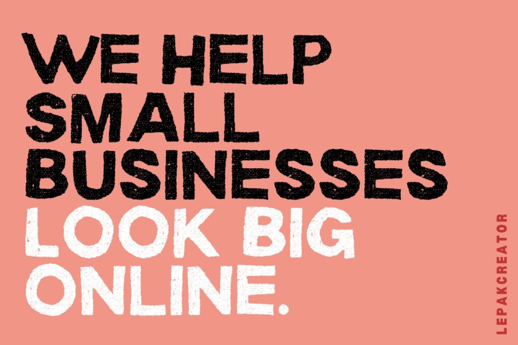
That’s where Lepakcreator comes in. We don’t simply apply templates—we engineer clarity. By applying strategic text hierarchy and intentional visual storytelling, we ensure your design:
✔ Communicates your key message first
✔ Guides the audience through a clear visual sequence
✔ Feels comfortable, meaningful, and aligned with your goals
BONUS: Learn more from us, for FREE!
More FREE & Fast Marketing related Tips, follow us on our Telegram channel now!
Concerns by many Marketers & Business Owners:
Q: What is text hierarchy and why is it important for business campaign visuals?
Text hierarchy is the order of importance placed on text elements using size, weight, color, and placement so viewers know where to focus first. It’s crucial because it directs attention towards key campaign messages before secondary details.
Q: How do I make my social media posts easier to scan and understand?
Use clear headline hierarchy (biggest text), consistent spacing, and contrasting colors with your brand palette. This helps viewers process information quickly—even when scrolling fast.
Q: How long do people take to judge a visual design?
Users form an initial visual judgment in about 50 milliseconds, so front‑loading your design with clear hierarchy increases the chance your message gets noticed.
Q: What are common mistakes in visual hierarchy that reduce campaign performance?
Overcrowding designs, misusing contrast, and inconsistent text sizing can confuse viewers. Prioritize clear structure and don’t let every element “fight” for attention.
Q How do cultural reading patterns affect text hierarchy design in Singapore?
In left‑to‑right language contexts like English or Malay, humans scan in predictable patterns (F‑pattern or Z‑pattern), so placing key messaging at natural focal points can lead to better engagement.
Q: Can text hierarchy improve my ad campaign ROI?
Yes—by ensuring audiences see your key message quickly, you increase the chance of click‑throughs and conversions, which ultimately improves campaign ROI.
Conclusion
A strong text hierarchy and thoughtful visual elements are not optional extras—they are core communication tools that turn random visuals into clear stories. Intentionally planning your typography, spacing, size, and color allows your audience to read your message with ease and confidence. Business owners frustrated by messy agency designs will benefit from a structured approach that prioritizes clarity and engagement. With the right hierarchy in place, will your next campaign finally tell the story you intend and drive real results?
(Credits: Piktochart, Pexels)
Since you’re here, why not Read: