Few years back, a small Singapore-based café rebranded with a trendy, minimalist logo that looked perfect on Instagram. Within weeks, customers began complaining that the new mark looked too generic and “felt like every other café.” Foot traffic dipped, and the owner realised the logo had not only failed to communicate the brand’s story—it had erased it. They reverted to a revised version of their original emblem, this time keeping the same visual cues that customers associated with the brand. The lesson was clear: a logo is not just a pretty symbol; it is a promise, a memory, and a shortcut to recognition.
In 2026, the same principle still applies. The difference is that logos must now work across more formats than ever—AI-generated content, short-form videos, wearable tech, and interactive web experiences. Choosing the right logo type and applying it consistently is no longer optional; it is a strategic advantage.
When you think about a logo, what comes to your mind?
Perhaps it’s a visual element positioned next to or above a brand name, creating a combination mark logo. This type of logo is the embodiment of how a logo is visually defined and happens to be the most commonly seen. Why is that? Simply put, it works like a charm and can be recognized as a logo at a quick glance.
However, this is just the tip of the iceberg when it comes to logo design.
Creating a comprehensive logo requires delving deeper into your brand’s story and fully grasping the brand’s requirements and desired communication with its audience. It’s essential to explore your options, starting with the various types of logos that are available to you.
Types of Logo Design
| Logo Design Type | Example |
|---|---|
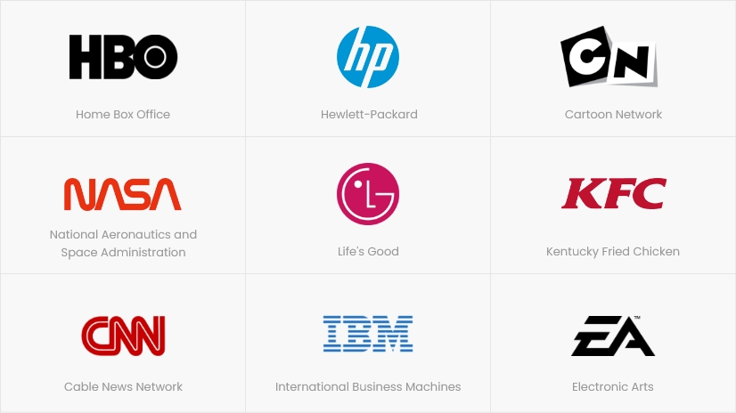
| 1. Lettermark Logo | CNN (Cable News Network) |
| 2. Wordmark Logo | |
| 3. Pictorial Mark Logo | |
| 4. Abstract Logo | Pepsi |
1-Lettermark Logo Design
Lettermark logos utilize fonts to represent the company’s name through abbreviations. CNN (Cable News Network) is a notable example. These logos benefit from familiarity with the public.
2-WordMark Logo Design
The Wordmark logos consist of the complete business name and are text-based. Google’s logo showcases an excellent example of Wordmark design, known for its elegant font and style.
3-Pictorial Mark Logo Design
A pictorial mark is a logo represented by a visual element. The Twitter logo and the Apple logo are both examples of pictorial marks.
4-Abstract Logo Design
Abstract logo designs are geometric marks. Pepsi’s logo serves as an excellent example of an abstract logo design.
| Logo Design Type | Example |
|---|---|
| 5. Mascot Logo | KFC |
| 6. Combination Mark Logo | Nike, Adidas |
| 7. Emblem Logo | Harvard University, Starbucks |
5-Mascot Logo Design
A mascot is based on a character. You can choose a mascot logo design if you want your business to represent a friendly and fun image. The KFC logo is a great example of this.
6-Combination Mark Logo Design
This type of logo design combines several types of logos. A combination mark logo design is ideal if you want your logo to include an image as well as fonts.
7-Emblem Logo Design
Emblem logo designs are preferred by educational institutions. As it closely resembles a seal, it is regarded as the oldest logo design. In smaller prints, your text may not be visible if the design is too complex inside the symbol.
What makes a Logo Professional?
A professional logo should be up-to-date to resonate with current trends and customer preferences. It needs to be versatile, adapting well to different business applications like websites, social media, and printed materials. A minimalistic design ensures simplicity and clarity. It should be suitable, representing the business accurately and aligning with its values. Lastly, an attention-grabbing logo captivates viewers, leaving a lasting impression and helping the brand stand out from competitors.
What to use Logo for your Brand?
To use your logo effectively for your brand, consider the following tips:
- Consistency: Use your logo consistently across all brand touchpoints to build recognition and create a cohesive brand identity.
- Size and Placement: Adjust the size and placement of your logo based on the context and medium where it will be displayed.
- Colors and Backgrounds: Maintain the original colors of your logo and create variations if needed to ensure visibility and legibility on different backgrounds.
- Typography: Use the specified fonts consistently in other brand communications to maintain visual consistency.
- Branding Guidelines: Develop clear guidelines for logo usage, including size requirements, clear space around the logo, and minimum reproduction sizes.
- Online Presence: Optimize your logo for digital platforms, ensuring it displays well on different devices and social media profiles.
- Print Materials: Utilize your logo on printed materials such as business cards, brochures, and signage, ensuring high resolution and suitable file formats for printing.
How Lepakcreator helps business owners who struggle with online marketing
Lepakcreator builds logo systems that are not only visually appealing but also strategically aligned with your brand story. We help you:
- Identify the right logo type for your brand and audience
- Create a consistent brand system that works across digital, print, and video
- Apply the logo correctly in marketing campaigns for better brand recall
If you want a logo that works as a strategic asset (not just a pretty picture), Lepakcreator can help.
People also asking online:
What is the best logo type for a small business in Singapore?
The best logo type depends on your brand name, audience, and industry. Most small businesses start with a combination mark because it balances recognition and flexibility.
How much does a professional logo design cost in Singapore in 2026?
Costs vary widely, but a professional logo system typically starts from S$500–S$10k and can go up depending on scope, brand strategy, and deliverables.
Can I use the same logo on social media, website, and packaging?
Yes, but you should use different logo versions (primary, secondary, icon-only) to maintain clarity across sizes.
Why does my logo look blurry on Instagram?
Blurriness usually happens when the logo is not exported at the correct resolution or when the design is too detailed for small sizes. A simplified icon version helps.
How to choose a logo style for a modern brand?
Choose a style that reflects your brand personality and customer expectations. For example, tech brands often use wordmarks or lettermarks, while lifestyle brands use combination marks.
Conclusion
In 2026, logos are not just symbols; they are functional assets that must work across mobile screens, video, and interactive experiences. Choosing the right logo type and applying it consistently is essential for building a brand that is recognisable, trustworthy, and memorable. If you are a business owner struggling with online marketing, Lepakcreator can help you develop a logo system that supports your branding strategy and helps you stand out. Are you ready to build a logo that truly represents your brand?
👉🏻 Look out for the latest Marketing & related Tips @lepakcreator Telegram Channel!
(Credits: Pexels)
Since you’re here, why not Read: