
“I never saw the colours of my brand until my customers told me they didn’t ‘feel’ it.”
When Jasmine, a café owner in Singapore, opened her doors she chose teal and coral for her brand because she liked it. She poured her heart into the menu—but footfall stayed low. After a simple redesign aligned with the mood she wanted customers to feel (warmth, trust, energy), her customer engagement jumped noticeably. That’s when she realised something vital: colour isn’t just decoration—it speaks directly to your audience before words ever do.
That invisible conversation between your design and your customer starts with colour. In this article we’ll unpack why understanding colour and choosing the right colour palette isn’t just design theory—it’s business strategy.
Why Colour Matters to Your Brand’s Visual Identity & Business
1. Thoughtful Planning Beyond Aesthetics
A well-chosen palette considers factors such as:
- Meaning & Emotion: Colours convey specific feelings and associations (e.g., blue = trust, green = growth).
- Alignment with Brand Values: Colours should reinforce what your brand stands for and resonate with your target audience.
- Hue, Tint, Tone, and Saturation: These subtle variations can drastically alter perception. A slightly muted red may feel sophisticated, while bright red may feel urgent or overwhelming.
- Visual Comfort: Overly bright or clashing colours can strain the eyes or confuse users, while a balanced palette guides attention naturally.
- Consistency Across Touchpoints: From social media posts to packaging, the palette should unify your brand experience.
It’s not about personal preference—it’s about crafting a visual experience that feels right and communicates effectively.
2. First Impressions Are Almost Entirely Visual
Research shows that 62–90% of first impressions about products or brands are based on colour alone—often within just 90 seconds of exposure. Thoughtful planning ensures your audience’s first impression is both positive and meaningful, not jarring or confusing. (
3. Colour Drives Recognition and Recall
Consistent, thoughtfully planned palettes improve recognition by up to 80%. When your brand uses colours that make sense contextually and emotionally, people are far more likely to remember it.
4. Colour Affects Consumer Decisions
Truthfully, colour influences about 85% of consumer choices, with many buyers admitting they choose one product over another based on colour alone. That’s why packaging, website visuals, ads, and even CTA buttons need thoughtful colour strategy—not random favourites.
Colour alone accounts for up to 90 percent of image judgments about products. While we are so familiar with colours, there is a wide range of uncertainty when it comes to using them in art and design.
Colour is perhaps the most important consideration when it comes to web and graphic design. A beautiful, engaging, seamless design relies on the right colour choice.
Even if everything else is in place, choosing the wrong colour can ruin a design.
Let’s take a look at an example. In the image below, you can see the exact same infographic – the same content, the same hierarchy, and the same positioning of elements.
What do you think looks better? Either A, which uses a fantastic colour combination that works well together, or B, which uses random colours without any rhyme or reason.
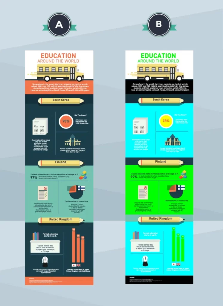
There is no doubt that A is the winner.
Let’s cover some of the basics of colour now that we understand its importance of it. Beginners need not worry. As someone who has never been artistic, I have found a few tricks to make you an expert on colour palettes in no time.
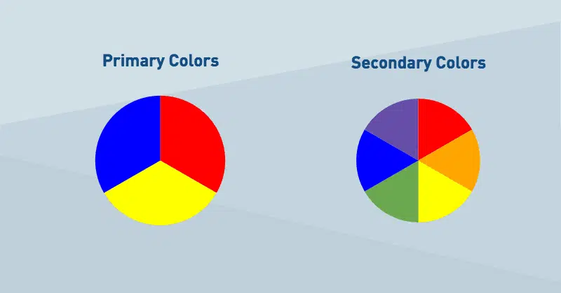
Primary Colours
Understanding colour theory begins with understanding the basics. There are three primary colours: red, blue, and yellow. A simple way to identify them is that they are colours that cannot be created by combining other colours. Using white and black, you can create all other colours.
As an alternative, secondary colours are created by combining three primary colours. Purple is created by blue and red; orange is created by blue and yellow, green, and red and yellow.
Tertiary colours are created by combining two secondary colours, but we’ll leave that for another time. Here’s where things get more complicated, so bear with me.
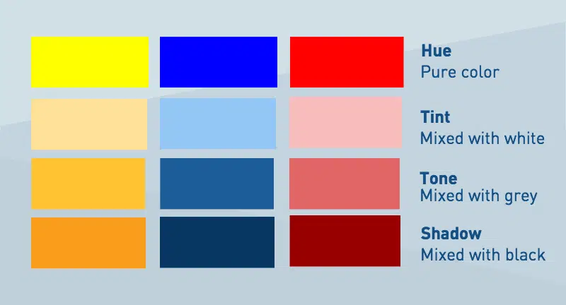
Hue, tint, tone, and shadows
In graphic design, primary, secondary, and tertiary colours are rarely used. Screens and prints look much better when all the colours are used.
Understanding colour requires an understanding of hue. Hues describe colours in fancy terms. Hues are not only primary and secondary colours, but also combinations of colours (e.g., green with purple).
As soon as black and white are added, things begin to get interesting. By using this method, millions of variations can be created. You can achieve tone, tint, and shadow by mixing a specific hue with white, black, or grey.
When white is mixed with a hue, it becomes tinted. In this way, colours appear softer and lighter, and light and dark hues can be played around with.
When you combine grey with a hue (or black and white), you get a tone. Essentially, you get a slightly different hue.
Black is mixed with a hue to create shadows. Due to this, colours become darker and more intense.
This graphic illustrates the differences between hues, tints, tones, and shadows. Compared to the primary colours, don’t you think these colour combinations look much more realistic?
Your colour palette should follow these 3 rules
As you now know the basics of colour theory on the web, it’s time to start applying them and pick your own colour palette! To do so, we will follow only three simple rules. Let’s take a look at it.
1-The first step is to match the overall tone of your infographic
The goal of an infographic is probably clear to you when you design it. The purpose of your writing may be to convey a message, provide valuable information, or simply entertain the reader. Creating your colour palette begins with considering your infographic’s goal and purpose.
Images that are not well done can confuse readers. In the same way, colours behave in the same way. Dark, shadowy colours are appropriate for infographics about horror movies. You can use blue as a hue and play with tint, tone, and shadow when you are talking about boats. Avoid bright, fun colours such as yellow or orange for a business infographic. Your brand will look more professional if you use darker colours.
2-Choosing complementary colours is the second step
Like typefaces, colours have their own characteristics. There are some that work well together, and there are others that do not. View the example below – which colour palette looks better?
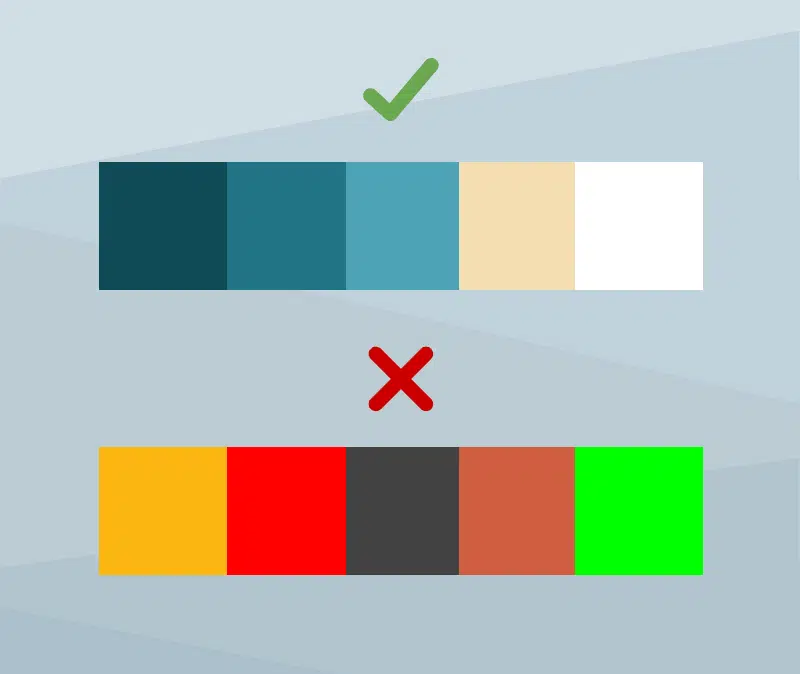
The first one, of course.
Although designers intuitively know which ones work well together, there is actually some science behind it. Understanding and visualizing the colour wheel is the first step. The graphic shows different hues and their tones, tints, and shadows in relation to each other.
Presented in monochrome
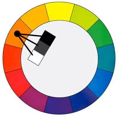
If you want to pick colours that work well together, go for a monochromatic palette. By this, I mean using a single hue, along with a variety of tints, tones, and shades.
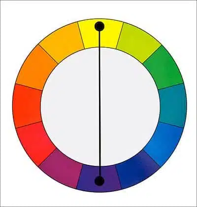
Complimentary
Those colours on the colour wheel opposite each other are complementary colours. You convey contrast and interest by combining these two colours. It is difficult to use these in large doses, but they are perfect for highlighting something, such as a call to action.
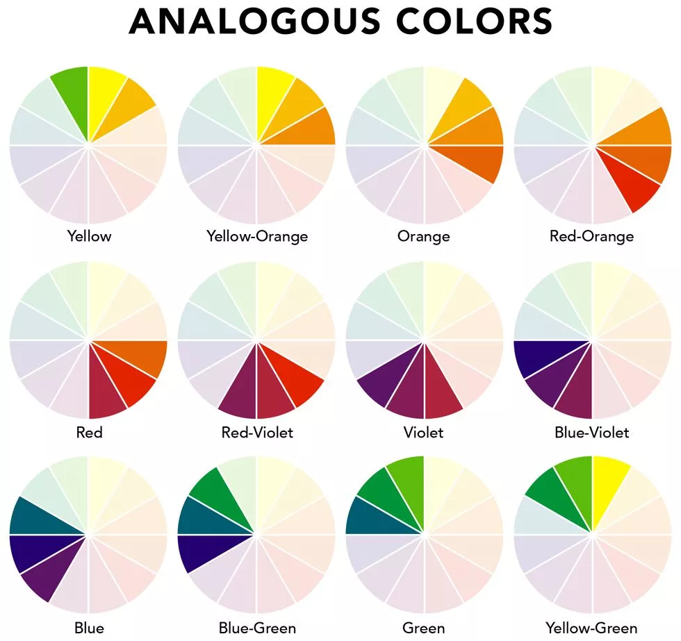
Analogous
A colour wheel that has adjacent colours feels comfortable working together. Additionally, they are effective for highlighting and adding contrast to specific elements without causing much disturbance. You should choose one dominant colour, one supporting colour, and one accent colour.
(Credits: Michael Stillwell)
You can find inspiration from colour.adobe.com, our most loved colour palettes if you’re lost.
3-Choosing 2-3 colours is the third step
There are times when simplicity is the best path. It is common for beginners to pick 5 or 6 colours for their designs. You should stick to just 2 or 3 – one should be clear and bold and the foundation of your design, while the second or third should be a complement that can be used as a call to action, or to highlight something relevant.
When in doubt, don’t give in. Play around with tones, tints, and shadows rather than picking 4-5 colours. It doesn’t take much to make a difference.
Understanding Psychological Color Meaning in Design
Each colour carries cultural, emotional, and behavioural cues. While interpretations vary slightly by region and context:
- Blue often signals trust and stability—popular with financial, tech, and healthcare brands.
- Red evokes energy, urgency, and passion—ideal for attention‑grabbing calls to action.
- Green suggests growth, health, and nature, commonly used by wellness and eco‑brands.
- Yellow radiates optimism and warmth—great for creative youth‑centric brands.
These aren’t mere aesthetics; they steer how customers feel before they interact with content or messaging.
The Business Impact of a Thoughtfully Planned Palette
When business owners choose colours strategically, considering comfort, meaning, alignment, and visual harmony:
- Customers feel at ease and trust your brand
- Engagement and conversions improve naturally because visual cues guide attention
- Brand identity becomes memorable, building loyalty and credibility
At Lepakcreator, we specialize in helping business owners who’ve worked with designers before but never achieved cohesive results. We go beyond picking pretty colours—we plan palettes that balance emotional impact, cultural meaning, and visual comfort, ensuring your brand communicates clearly and consistently across all touchpoints.
FAQ – Colour Palette & Design
Q: How can I plan a colour palette that is comfortable and meaningful for my audience?
Focus on the psychological impact of colours, hue and tone variations, and cultural associations. Test how combinations feel visually to ensure they guide attention naturally without overwhelming.
Q: Does tone and tint matter in branding?
Absolutely. Slight adjustments in tint (lightness), tone (grey balance), or saturation can make colours more approachable, luxurious, or calming—affecting customer perception subconsciously.
Q: Can poor colour choices harm my brand credibility?
Yes. Inconsistent or visually harsh palettes can confuse users, reduce readability, and create distrust—even if your product quality is high.
Conclusion
Selecting the right colour for your brand is more than preference—it’s a strategic, multi-layered decision. Thoughtful planning that considers meaning, alignment, hue, tone, and visual comfort creates a palette that communicates effectively, builds trust, and elevates your business. Business owners who struggle to see results from previous design efforts often miss this deeper planning step.
So, the question is: how can you plan your brand’s colours to create a visually harmonious and emotionally resonant experience for your audience?
(All other Credits: Piktochart)
👉🏻 Look out for the latest Marketing & related Tips @lepakcreator Telegram Channel!